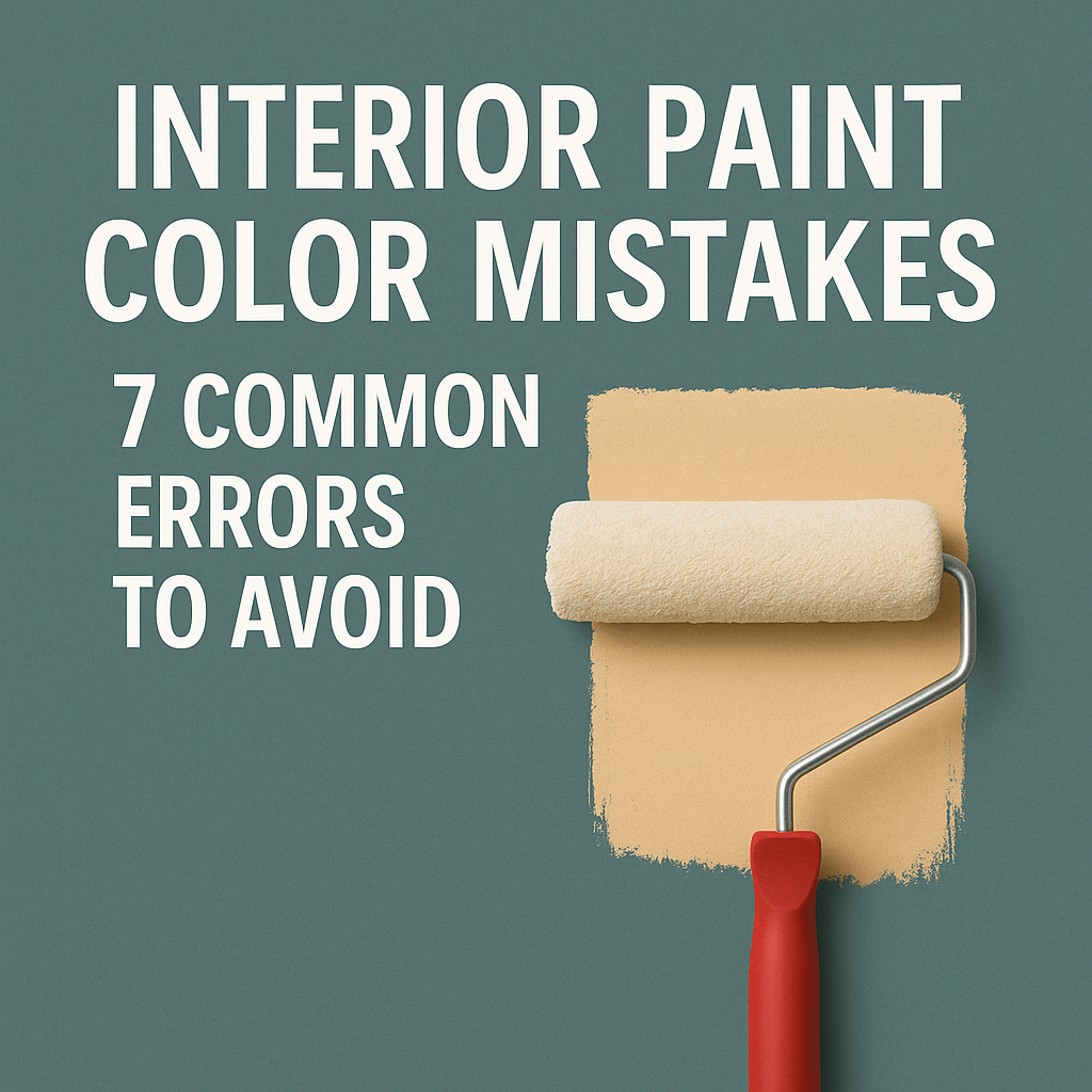
Introduction
Paint can transform your space—if you choose the right one. But too often, homeowners make interior paint color mistakes that lead to mismatched undertones, poor lighting effects, or the wrong finish. These small decisions can ruin the final result.
In this post, you’ll learn how to avoid the 7 most common paint color mistakes so you can get it right the first time.
🖥️ Interior Paint Color Mistake #1: Choosing from a Screen
Digital screens alter colors. A shade that looks perfect online may turn out too cool, warm, or completely different in real life.
✅ Fix It:
- Always test physical paint swatches or sample pots
- Apply them to your walls
- View in natural and artificial light throughout the day
🌞 Paint Color Mistake #2: Ignoring Lighting Conditions
Light—both natural and artificial—can change the appearance of any color. This is a major cause of interior paint color mistakes.
✅ Fix It:
- Check how colors look in morning, afternoon, and evening
- Use LED bulbs that mimic daylight for indoor testing
- Know that north-facing rooms tend to cool colors; south-facing warm them up
🧱 Interior Paint Color Mistake #3: Forgetting Fixed Features
Your paint needs to coordinate with your space—not just the idea in your head. Ignoring flooring, countertops, and cabinetry leads to mismatched tones.
✅ Fix It:
- Compare paint samples next to permanent finishes
- Look for undertone conflicts
- Build your paint palette based on your existing materials
🖌️ Interior Paint Color Mistake #4: Skipping Sample Swatches
This is one of the easiest interior painting mistakes to avoid. The sample chip is rarely what the full wall will look like.
✅ Fix It:
- Paint 2×2 ft test patches on multiple walls
- View during different times of day
- Sit with the color for a few days before deciding
💡 Mistake #5: Picking Trendy Colors Without Planning
Trendy paint colors look amazing online—but might overwhelm a small space or clash with your home’s character.
✅ Fix It:
- Use bold or trendy colors as accents, not base wall colors
- Choose timeless hues for long-term appeal
- Always test before committing
🎯 Interior Paint Color Mistake #6: Overlooking Undertones
Many “neutrals” come with sneaky undertones—blue, purple, pink, green. Missing these is a classic paint color mistake.
✅ Fix It:
- Compare several similar swatches together
- Test against white trim or warm floors
- Match undertones with your home’s finishes
🧽 Interior Paint Color Mistake #7: Using the Wrong Finish
Finish matters just as much as color. Choosing the wrong one affects light reflection and durability.
✅ Fix It:
- Use flat for ceilings and low-traffic walls
- Choose eggshell/satin for most living spaces
- Use semi-gloss/gloss for kitchens, baths, and trim
🧠 Bonus: Create Whole-Home Color Flow to Avoid Mistakes
Many interior paint color mistakes happen when rooms feel disconnected. A home that flows visually feels larger and more intentional.
✅ Fix It:
- Select 3–5 complementary colors
- Repeat accent tones through rooms
- Keep undertones consistent across spaces
Conclusion
Avoiding interior paint color mistakes isn’t complicated. By paying attention to light, finish, and undertones—and testing before you paint—you’ll make confident color choices that elevate your space.
If you need any information, or you want a quote for your project, please contact us by clicking the button.